Redesigning the Gordon Ramsay Booking Experience
By Chris Annetts — 14 October 2025
Booking a table at one of Gordon Ramsay’s restaurants should feel exciting — but on the brand’s own website, it doesn’t. The experience is functional but with very little sense of occasion. It technically works, but it’s rigid, transactional, and it doesn’t feel at all like Gordon Ramsay.
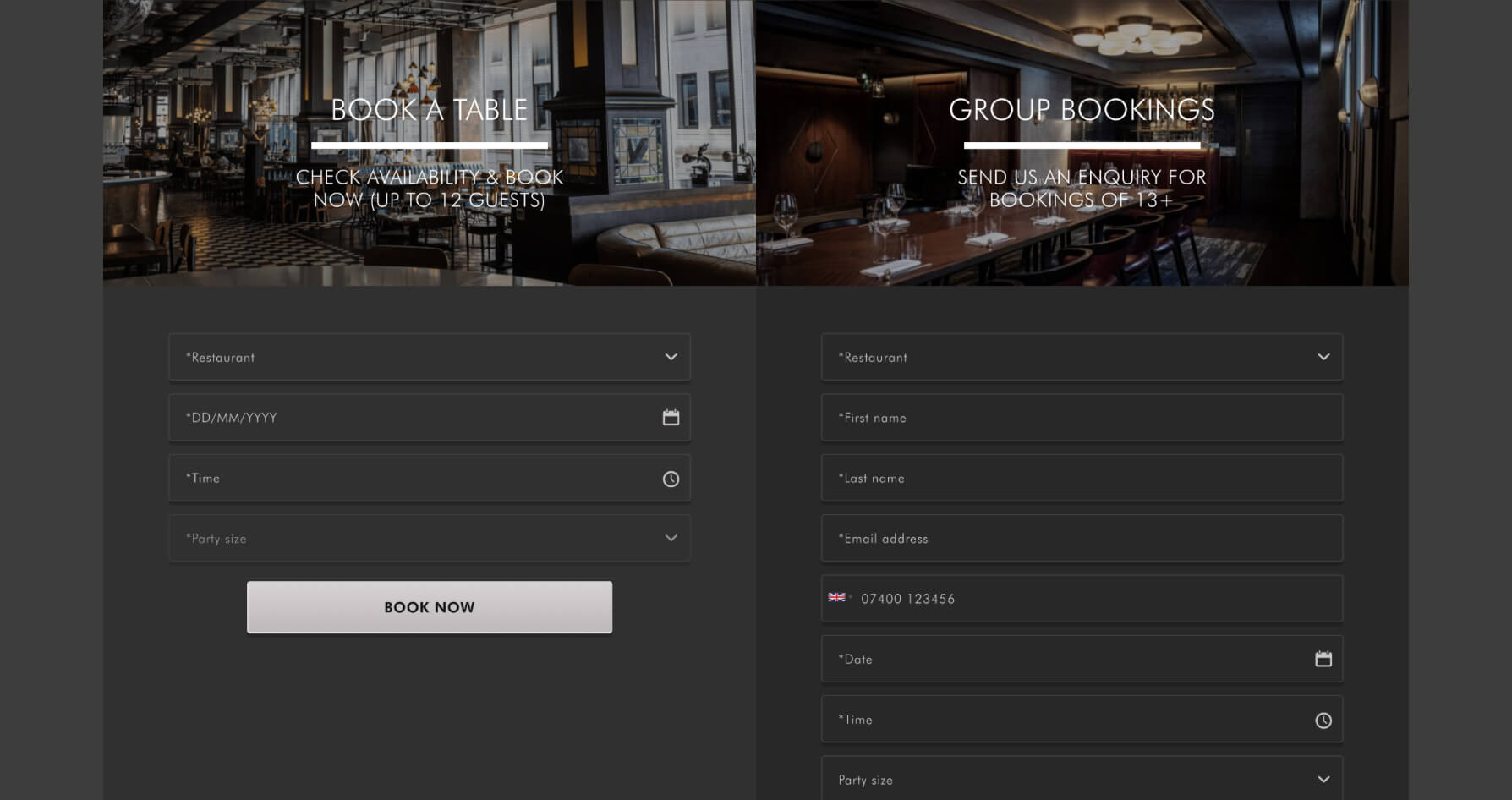
The problem isn’t just aesthetic; it’s structural. The flow is split in two — one form for small bookings, another for larger groups — both asking for almost the same details. Before you can see a single restaurant, you’re asked to choose one. Every input hides behind another, and if you change your mind about the restaurant, your date, time, and party size choices vanish with it.
Nothing here is truly broken, yet everything feels slightly misaligned. For a brand built on energy, pace, and confidence, the current experience feels procedural — more like booking your MOT than booking dinner.

Framing the challengePermalink
This started as a self-set brief — a chance to see what would happen if Gordon Ramsay’s booking flow were redesigned from the ground up. Not to make it prettier, but to see if it could work harder: faster to use, easier to understand, and more aligned with how people actually choose a restaurant.
Every restaurant in the Ramsay group already has its own site. So if someone ends up on gordonramsayrestaurants.com, they’re not here to rebook a favourite. They’re here because they’re curious — about the brand, the range, or what’s nearby. They’re exploring.
That distinction matters. Someone on a restaurant’s own site is ready to book. Someone on the main brand site is ready to discover.
The current experience doesn’t show much nuance in that difference. It’s a booking form built for conversion, dropped into a context that should celebrate choice. The opportunity was to flip that — to create an experience that starts with exploration and naturally leads to booking.

Who this is forPermalink
To make sense of what this redesign needed to achieve, I started by looking at who actually uses the booking page. It isn’t one type of person — it’s several:
- The spontaneous diner, already nearby and looking for something right now.
- The planner, who has a date in mind but isn’t sure where to go yet.
- The celebrator, booking for a group or special occasion.
- The explorer, browsing the Gordon Ramsay world just to see what’s out there.
The current experience treats all of them the same — as people who already know what they want. The redesign needed to support all of them without creating separate paths or extra screens.
That meant starting from the shared reality of how people book restaurants: some know the place, some know the time, some only know their budget — but everyone needs a clear next step. The system had to make sense from any of those starting points.

Dissecting the originalPermalink
Before rethinking anything, I wanted to understand what makes the current experience feel so heavy. On paper, it does everything you’d expect: it lets you pick a restaurant, a date, a time, and a party size. In practice, it does it in the least helpful order possible.
- Duplicate inputs. Two separate forms — one for standard bookings and one for groups — both ask for the same core details. It’s a split that adds confusion without solving a real problem.
- Hidden content. No restaurants are visible by default. You’re asked to choose one before you’ve seen what’s available.
- Dropdown overload. Every field is hidden behind a dropdown: restaurant, date, time, and party size. It flattens what could be an engaging discovery process into a sequence of admin tasks.
- No sensible defaults. Everything starts empty. Even obvious assumptions, like two guests for today, have to be entered manually.
- State loss. Changing restaurant clears the other fields, which makes casual exploration frustrating.
- No sense of context. The design doesn’t show the breadth of the Ramsay portfolio, or the tone of any of its restaurants. It just feels generic.
It technically works, but it lacks rhythm, forgiveness, and hierarchy — the things that make a system feel effortless. It’s a form that collects data rather than a flow that helps you decide.

Rethinking the flowPermalink
The goal wasn’t to redesign the form — it was to redesign the approach. Instead of asking users to fill in a set of fields before showing them anything, the new flow shows what’s available from the start and helps them narrow down from there.
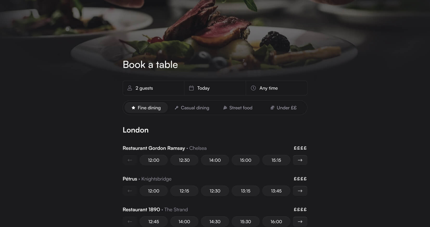
That shift changes the tone completely. It moves from “tell us everything first” to “here’s what’s open — what suits you?”. It turns the experience from passive data entry into active discovery.
The system now starts with smart defaults — two guests, today, any time — so there’s always something meaningful on screen. Users can then refine their search naturally: adjust the date, tweak the time, or increase the party size. Every choice filters the results in real time, without resets or reloads.
For the user, it feels like browsing. For the business, it means one adaptable system that scales intelligently across dining styles and automatically flexes for larger groups — without fragmenting into multiple journeys.

The system in detailPermalink
To keep the experience fast and manageable, the redesign splits the restaurant list into four broad categories: Fine dining, Casual dining, Street food, and one focused on cost-conscious options. Each category represents a different pace and price point of eating out — not just for the user’s benefit, but to keep the system performing well. By only loading one category at a time, the design avoids calling for every restaurant’s data and availability at once, cutting unnecessary API requests and keeping the interface fast.
Within each category, restaurants are grouped by city. It helps users orient themselves quickly while keeping the experience inclusive — someone in Edinburgh still sees what’s open in London, but the list feels ordered rather than endless. The structure also guarantees that every tab, on every day, always has something visible; there’s no such thing as an empty screen.
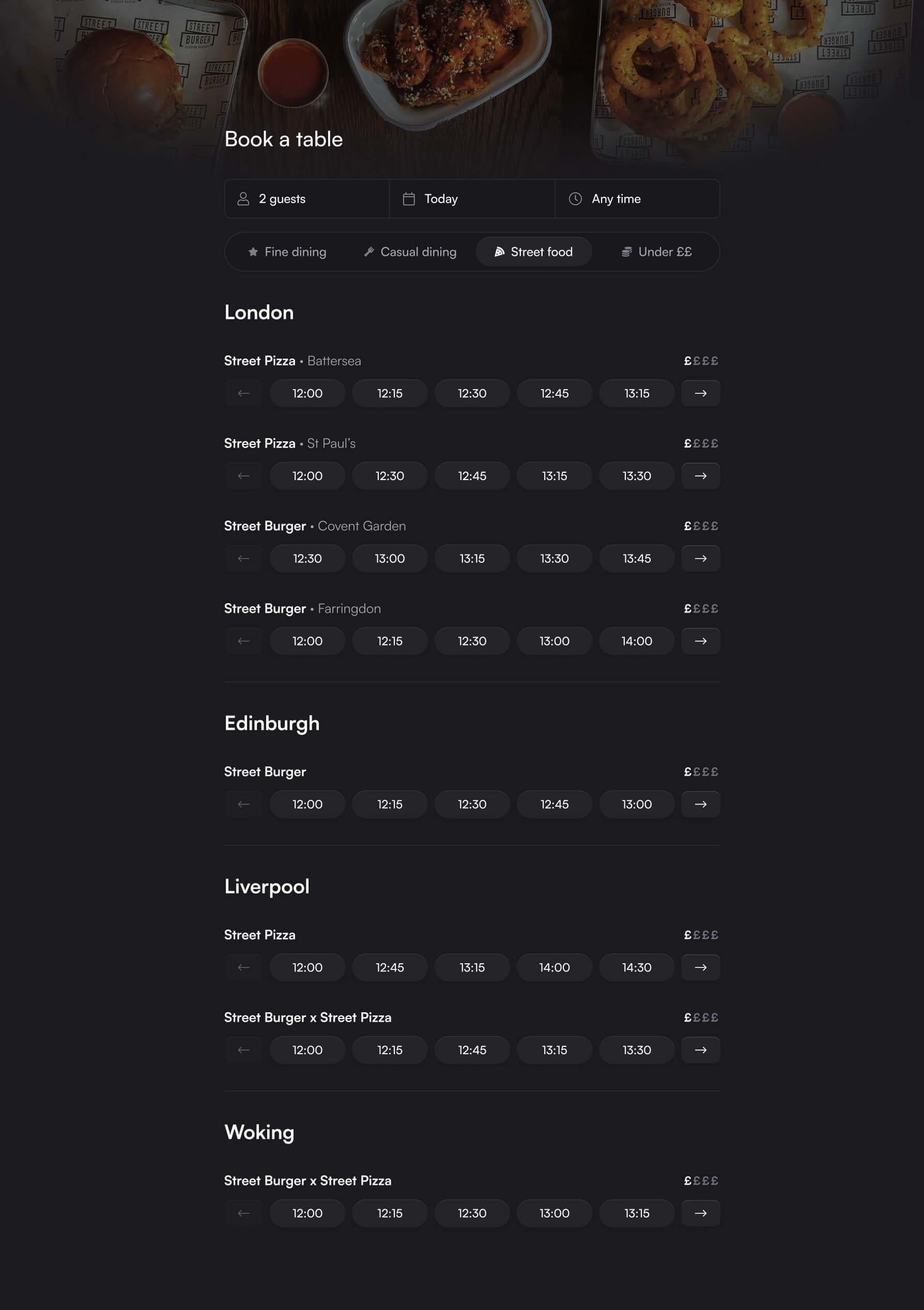
The cost-conscious category was deliberately phrased as Under ££. It’s a compromise between clarity and tone — clear enough for users who are browsing with a budget, but respectful of how a brand like Gordon Ramsay would want to present itself. Words like “budget” or “affordable” would feel off-brand, but the £ notation is already familiar across menus and restaurant listings.
Each restaurant shows a horizontal row of available times — simple, direct, and easy to scan. The original dropdowns forced users to open, scroll, and guess; the new format immediately puts availability on display. The times are generated from the restaurant’s real service data, so a location that opens late for lunch or closes early for dinner only shows valid options. The system would call for availability in small batches, caching results and progressively revealing more only when the user scrolls or switches dates.
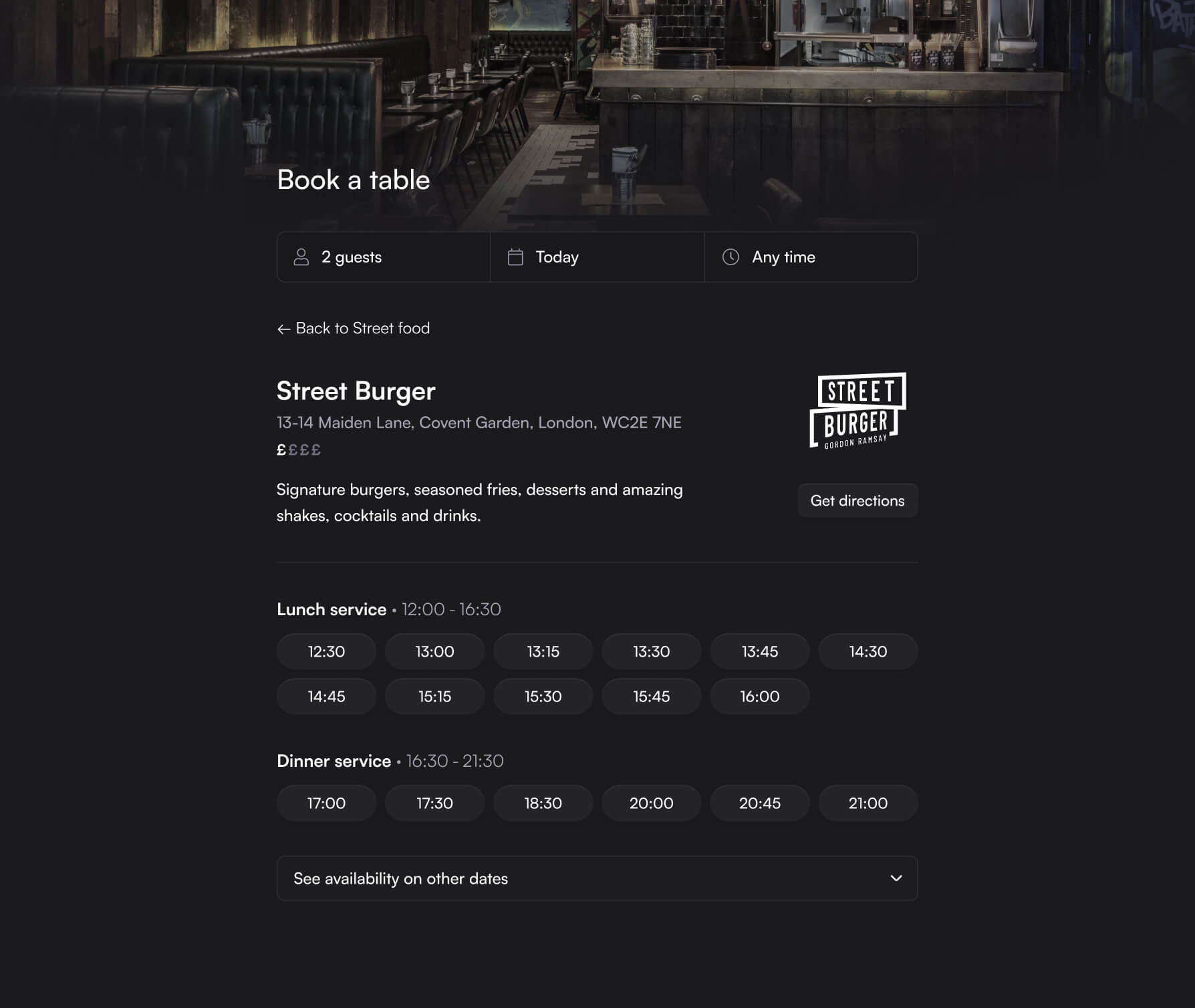
Clicking a restaurant opens a focused view with the essentials: name, logo, address, a short description, and all bookable times for that day. Instead of listing full “opening hours,” the design shows the day’s service periods — for example, Lunch (11:30–16:30) and Dinner (16:30–21:30) — giving users a quick sense of when the restaurant is serving that day, without the visual noise of a full weekly schedule.
For larger parties, the logic adjusts automatically. Once a group size of 13 or more is entered, the time selectors are replaced by enquiry prompts. The current system expects users to choose the right route; this one makes that decision for them.

How this supports every user typePermalink
The redesigned system works because it adapts naturally to the different ways people use it.
- The spontaneous diner sees available tables immediately and can book in seconds.
- The planner can browse by dining style or location, exploring options before committing to one.
- The celebrator automatically triggers the group mode when entering a larger party size — no need to pick the right route first.
- The explorer can wander across categories and budgets, discovering what’s possible within the Ramsay collection.
Every use case has a path that feels intuitive, without adding complexity or extra screens. The same logic that improves usability also improves scalability — one system serving many types of user, effortlessly.

A more discoverable, human systemPermalink
The redesign doesn’t reinvent restaurant booking — it just puts the user back at the centre of it. By focusing on visibility, context, and performance, it turns a static form into something that feels alive: faster, clearer, and far less frustrating to use.
What makes it work isn’t complexity — it’s restraint. The system shows enough to act, but never more than you need. It understands that not everyone starts with a date or a restaurant in mind. Some start with curiosity, some with a budget, others simply with a reason to gather.
That’s the role of good product design — to remove friction quietly, and to make the path from intent to outcome feel obvious in hindsight.