Improving the Tesco Loan Calculator
By Chris Annetts — 23 July 2021
I've recently started referring to myself as a 'web form designer'. I haven't spotted anyone else doing this, and so describing what I do has been as difficult as you might imagine. To help clear things up, I decided to document how I might attempt to improve an existing web tool.
I wanted to find a web form that I already considered to be good, but not perfect. A completely overhauled, unsolicited reimagining of someone else's work might be fun, but it wouldn't account for any of the real-world constraints people work within. Instead, I looked for opportunities to make small improvements to something that was already pretty well executed.
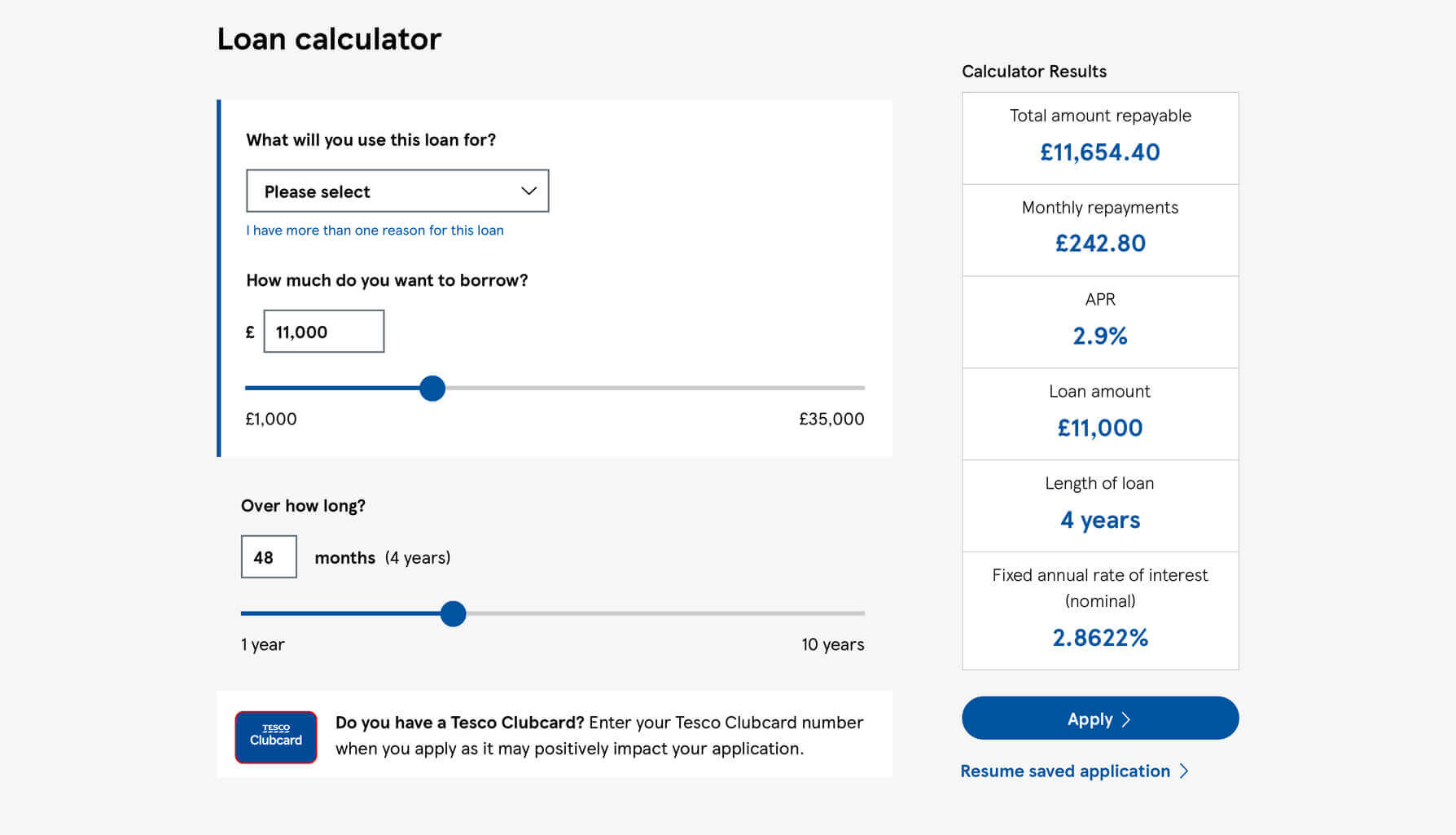
The Tesco Bank loan calculator is a web-based tool that allows users to not only understand how much they could borrow and for how long, but to estimate their monthly repayments, interest rates, and how much they might end up paying back.
Before I critique anything, I'd want to reiterate how much I like this tool. The real-time presentation of key figures is a great way to communicate the impact of the user's choices, and the tool itself feels entirely in keeping with the brand. Small details like the rich formatting of number inputs and use of subtle animation are real touches of quality. That being said, I think there's room for improvement.
Container only wraps two questionsPermalink
When we encounter questions in a single, defined area of a web form, we tend to perceive them as being related. Conversely, when questions fall outside of the defined area, it's an indication that they aren't related.
A visible container that wraps some of the questions, but not all of them, increases the likelihood of the user incorrectly assuming that the container encapsulates everything they need to interact with.
The solution
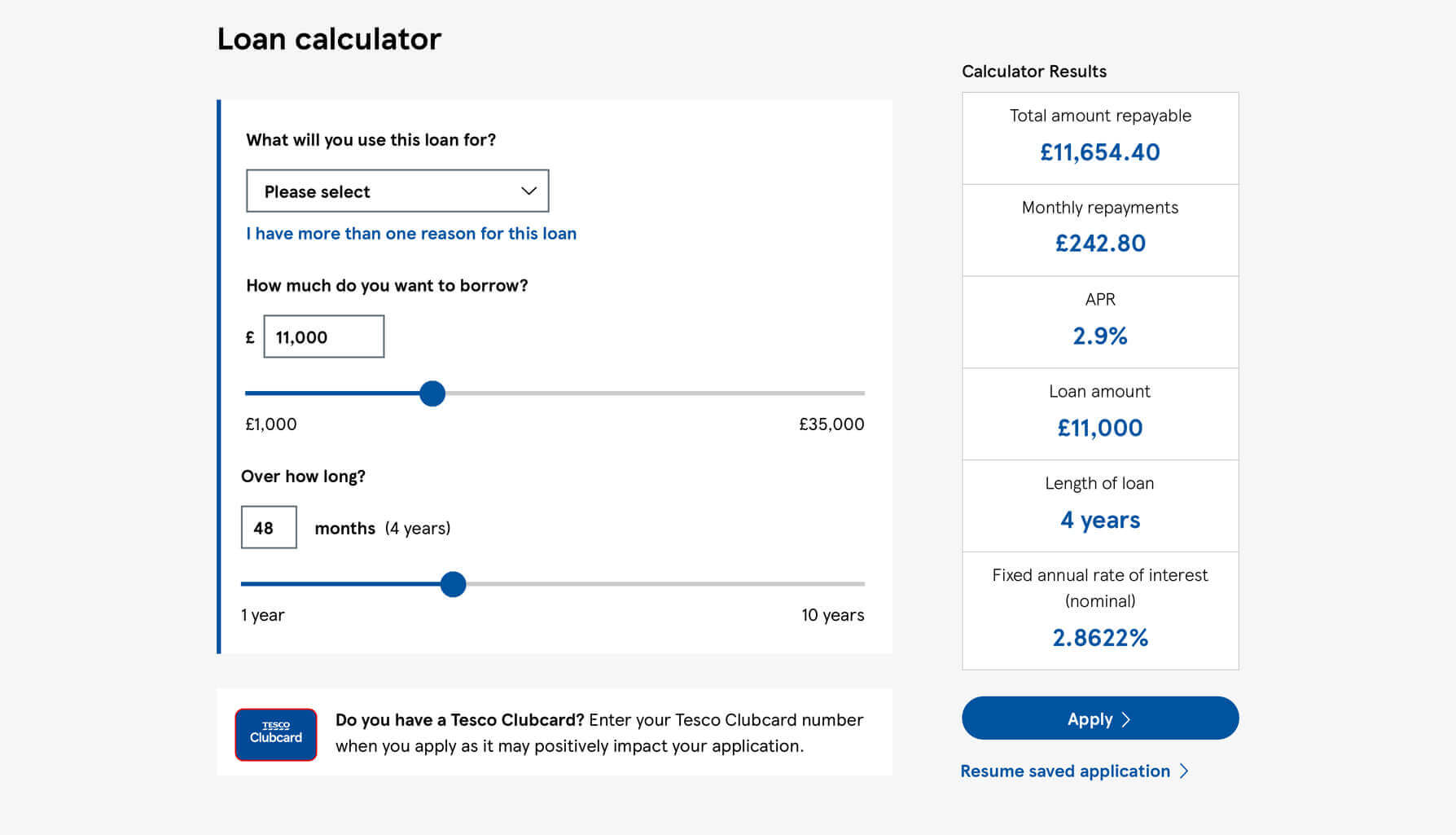
To make it clearer which questions need to be answered, we could include every question within a single container, helping the user to understand exactly which inputs they should be interacting with.
Excess use of heavy font weightsPermalink
Heavier weighted text is a great way to emphasise or draw attention to specific elements within an interface, creating a contrast against everything else. But when everything is big and bold, nothing stands out.
As a new user of the Tesco loan calculator, the most important thing for me to understand is what is needed of me to use it. A good way to communicate not only how a tool like this works, but how much effort it'll take to use, is to highlight the questions themselves.
The solution

By reducing the font-weight of every other element, the questions themselves would stand-out against a de-emphasised backdrop, making the key information more prominent and the form as a whole more easily scannable.
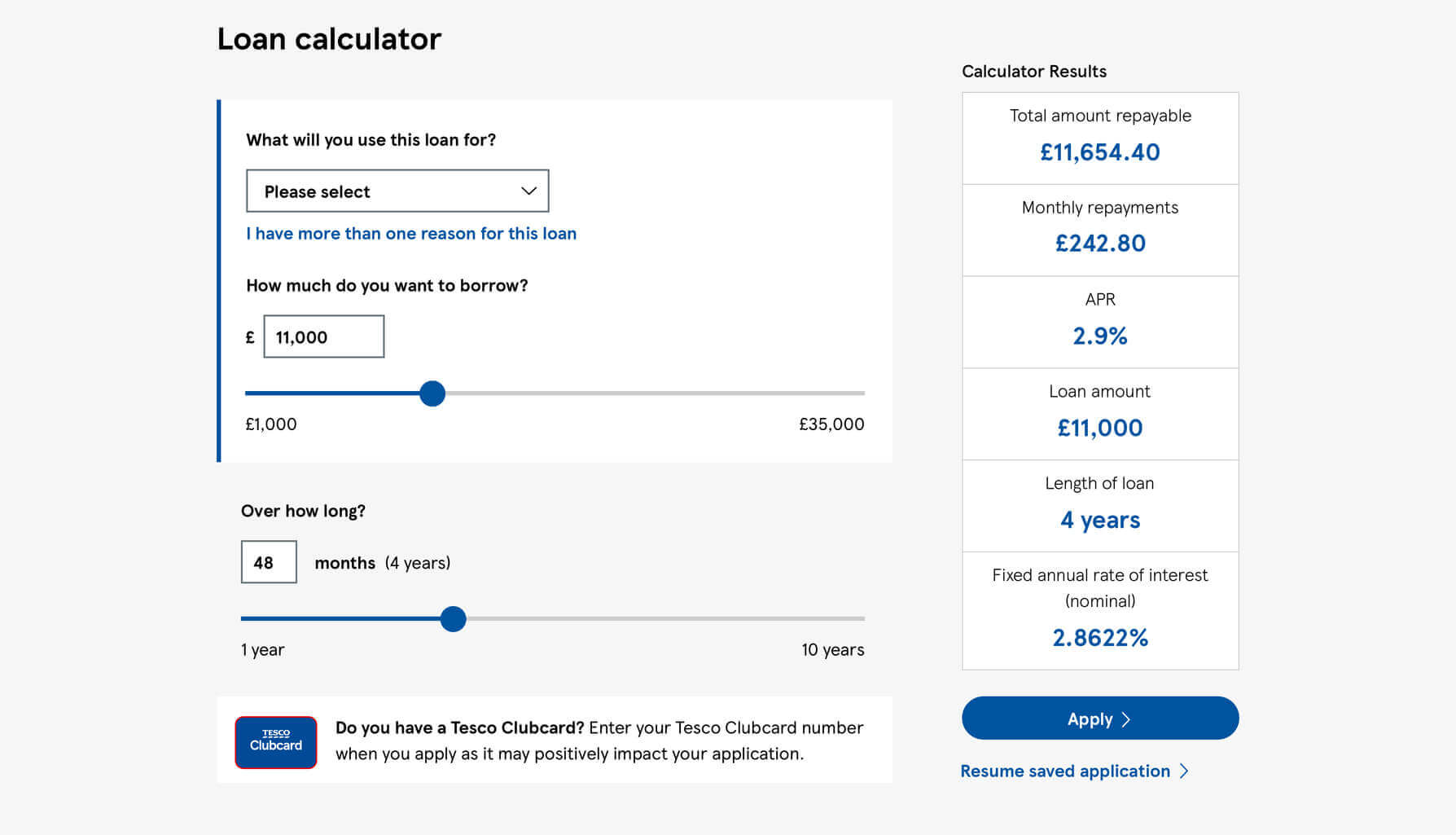
Misaligned input fieldsPermalink
Any visual misalignments can make a form feel chaotic and disorderly. No matter how concise or well thought out the questions themselves are, a scary looking form risks putting users off in the same way a poorly designed tool might.
A user’s visual fixations are more varied when they're not able to scan in a consistent vertical direction, making it more difficult for them to predict where to focus their attention next, and forcing their eyes to work harder than they otherwise would.
The solution

Create consistent, predictable alignments in the interface. Here, the issue can be solved by simply moving the pound-sign mask inside the input, rather than being to the left of it.
No option to change the repayment unitPermalink
The longer you work with people, the more you realise how different we all are. Our upbringing, education, experiences, impairments, environment, and many more factors play a role in how we engage with any web form we encounter.
It's important to accommodate the different mental models your users have of any given task, by providing them with the tools to answer your questions in the most natural way possible for them.
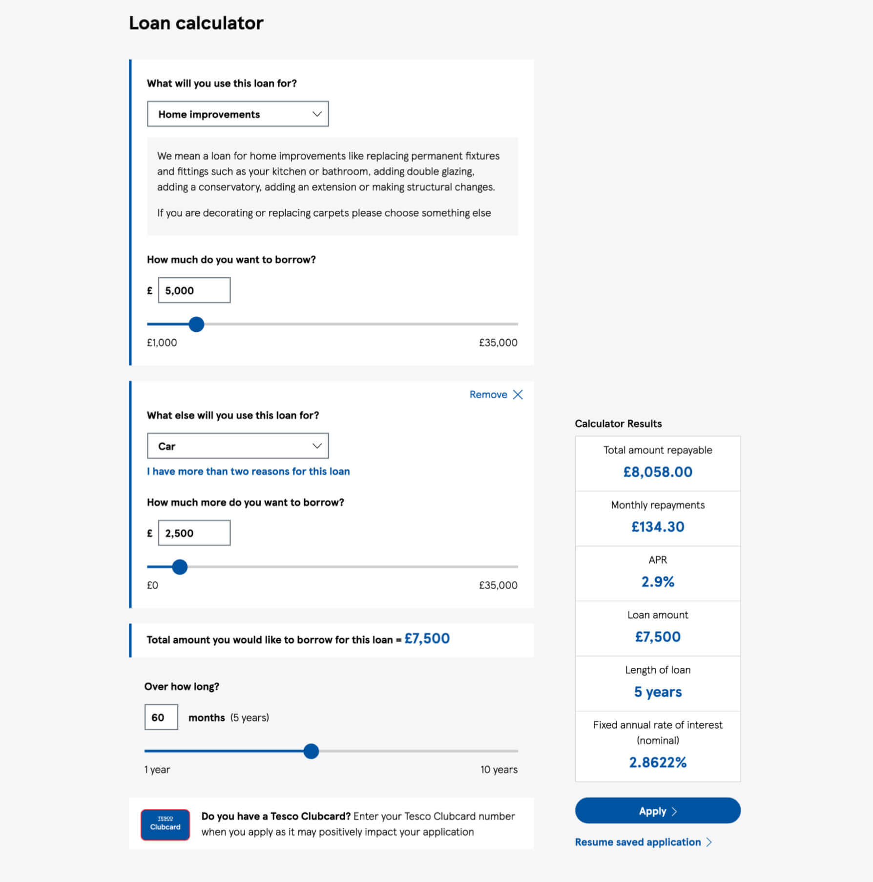
The Tesco Bank loan calculator allows users to enter their loan repayment period in months. Depending on the user and their own circumstances, this may result in them having to channel their inner Carol Vorderman by converting a long period of time from years into months.
The form goes some way to acknowledging this, offering a months-to-years calculation, but that only confirms to users that their maths was correct, rather than removing the need for them to think unnecessarily in the first place.
The solution
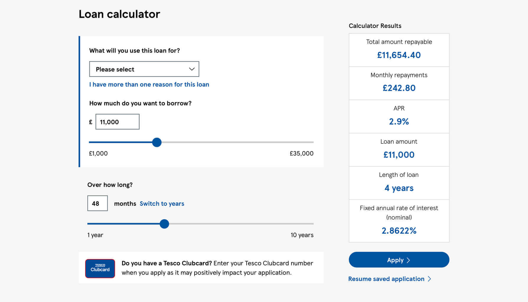
Instead of forcing people to think like somebody else, grant them the flexibility to switch between different unit types. The NHS BMI Calculator does this well, allowing users to toggle between entering their height in feet/inches or centimetres, and their weight in stone/pounds or kilograms.
While short-term loans are usually thought of in terms of months, many of us will visualise anything over 24 months in years. Allowing users to switch between entering their repayment period in either months or years would be a quick way to meeting the needs of all users, rather than some.
Excessive space between related itemsPermalink
Humans tends to perceive elements that are placed close to one another as being related, which means we can use proximity alone to create visual groupings.
The excessive space between form labels and their associated inputs, relative to the fairly small amount of space between questions, makes it more difficult to determine which items are related.
The solution
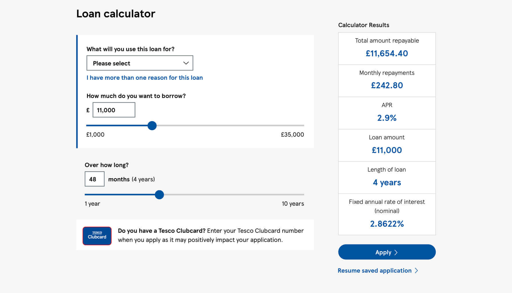
By reducing the space between related items, we immediately see distinct groups of elements and clearer relationships between them.
Text link is overly prominentPermalink
Not every element on a page is equal, and we very intentionally want certain aspects to be more pronounced than others; an 'Add to basket' button will, in most cases, be more important than a link to the company privacy policy. Size, contrast, and order are just a handful of ways we can emphasise (or de-emphasise) certain parts of an interface.
It's fair to assume that more people take out loans for a single purpose than those who are looking to finance multiple purchases. If that is correct, a majority of users will have no need to add an additional loan type, so the link allowing them to do so need not be weighted so prominently.
The solution
By reducing the size of the text, and thus making it smaller than the base font size, the link is now more appropriately weighted when compared to the elements which are useful to everybody.
Use of colour-only linksPermalink
A few exceptions aside, text-based links should be both coloured and underlined to maximise the chance that our users interpret them correctly.
Underlined links are essential for low-vision users, where colour alone may not be enough to differentiate between what is a link and what isn't. Given the likely range of ages and impairments across a vast audience, it seems appropriate to prioritise clarity and inclusion.
The solution
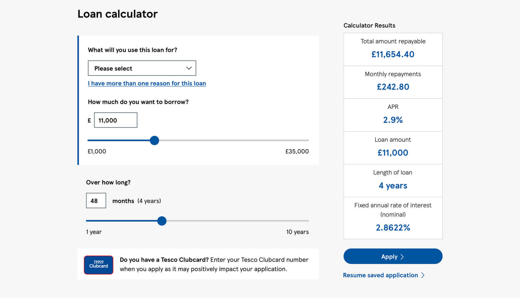
Underlining the text in question increases the affordance of 'clickability', communicating more clearly how to interact with the link to a wider, broader range of users.
Mixed alignments within contentPermalink
While aesthetics are rarely the most important part of an interface, small imperfections can make our work appear unbalanced.
One mistake we commonly make is to combine different alignments, which as well as creating an awkward visual relationship between elements, makes your content more difficult to read. In the loan calculator, the right-hand sidebar mixes both left and center alignments.
As a simple rule of thumb, centered headlines should be paired with centered text, and left-aligned headlines with left-aligned text.
The solution

By centering the 'Calculator Results' heading and the 'Resume saved application' link in the sidebar, the entire column feels more harmonious and easier to read.
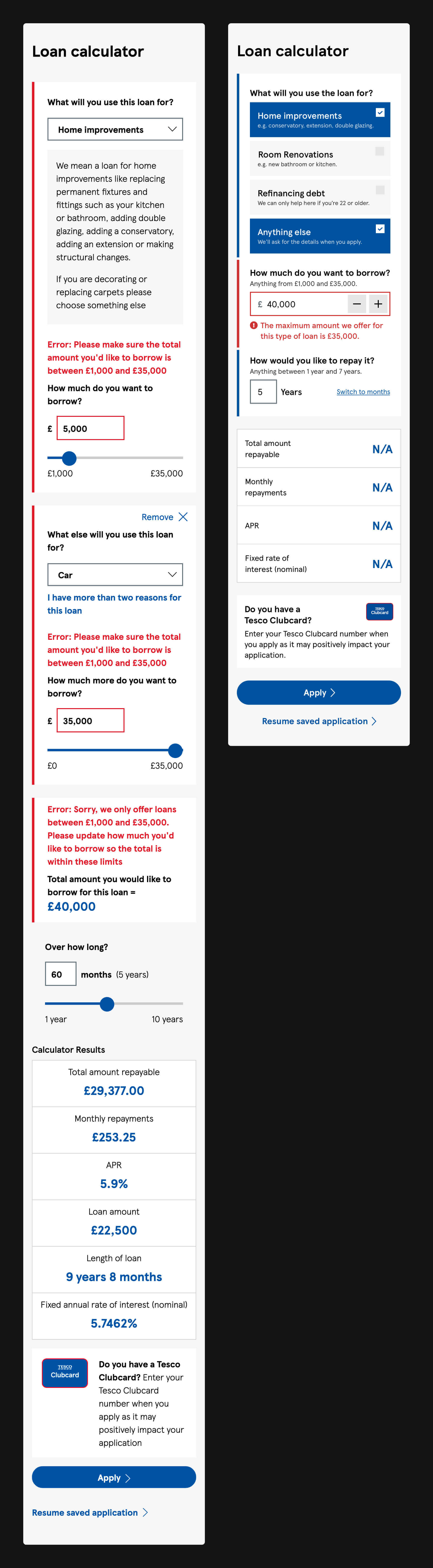
Placement of error messagesPermalink
Having multiple ways to enter the same information makes it more difficult to know where to place any error messages. Best practice says that they should be displayed next to or below the erroneous input, but where does that error message go if there's more than one way to answer a question?
In the loan calculator, the error message isn't next to either, and is instead placed at the very top of the form group.
The solution
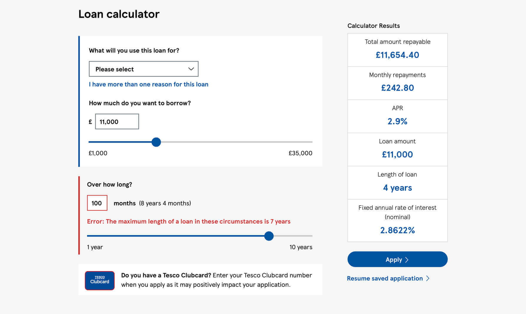
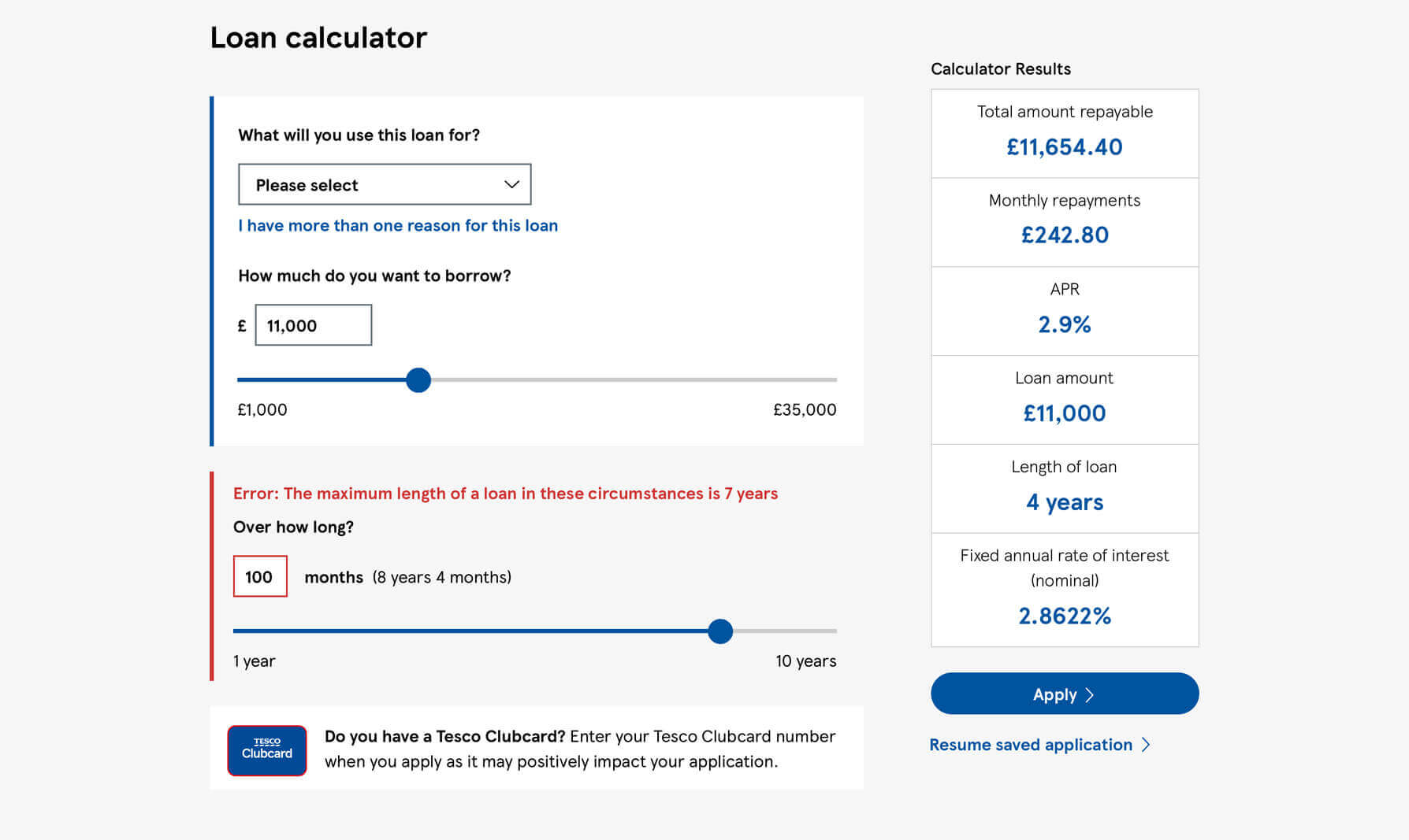
The primary input is the number input, with the range slider an alternative method to typing your chosen amount. As such, the error messages would be better displayed directly below the input itself.
Further issuesPermalink
Error messages not 'human friendly'
Error messages are simply human-to-human explanations, but they're so often written in a robotic tone, and with unnecessary technical jargon that helps nobody recover from an issue they've encountered.
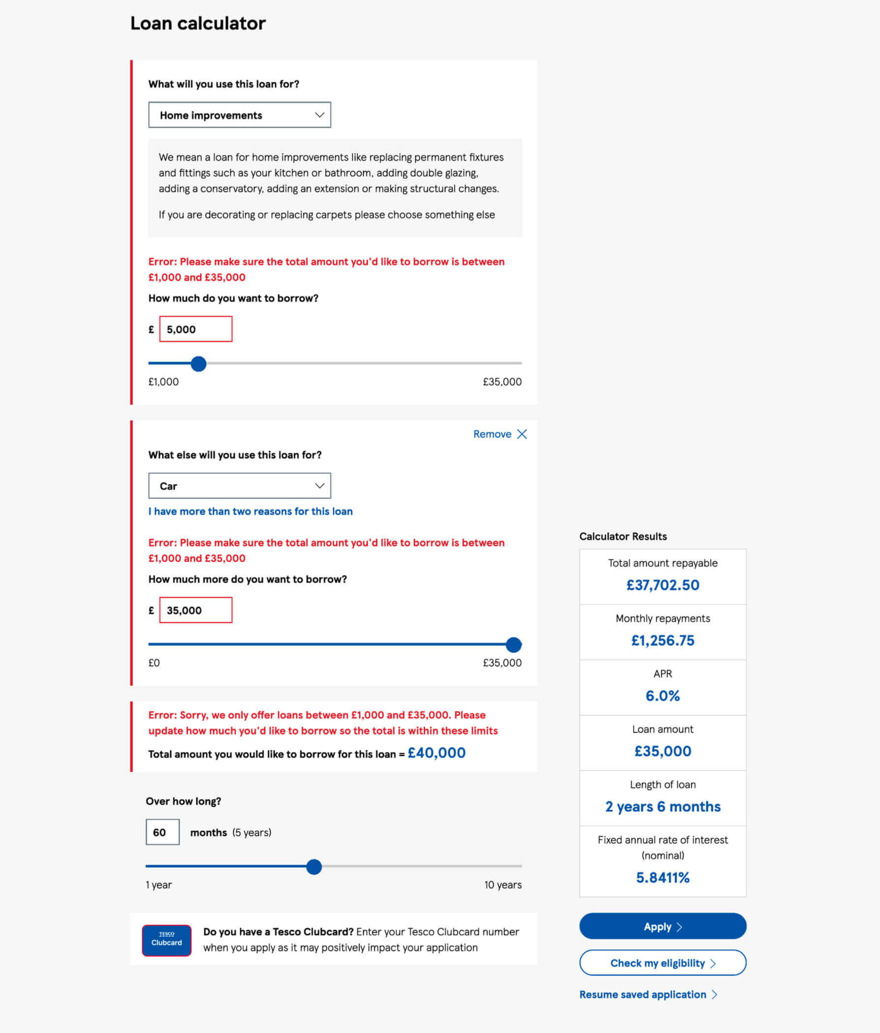
When you try and borrow too much or too little, you're presented with the message, "Error: Sorry we only offer between £1,000 and £35,000". I can work out what this means, but the phrasing lacks context, clarity, or instruction.
I like to avoid using the word 'error' in an error message, and try not to write messages in a way that I wouldn't be comfortable speaking out loud. Favour softer, more natural language where possible, and speak to your users like they're humans.
Range slider bar difficult to interact with
The range slider works reasonably well when dragging the large circle (the range thumb), but you need to have the motor skills of a Shaolin master to manipulate the value using only the bar (the range track).
Ana Tudor wrote a great post for CSS-Tricks in 2017 that covers this very issue; use the min-height property to increase the actionable target size of the entire input, and not simply the range thumb. This will mean that users can more easily interact with any part of the input, rather than just one part of it.
Calculator results don't follow on scroll
The purpose of this calculator is to help the user understand not only how much they can borrow and for how long, but what the impact would be on them financially. Different loan amounts over different repayment periods have a direct impact on their repayments, so being able to see the consequence of your own choices in a single view would make a lot of sense.
The split-out approach used to capture multiple loan purposes means that the section where the user enters and amends their input can become really quite long. As such, the results themselves are often out of view.
This problem is an ideal candidate for using CSS's sticky positioning; when the screen is longer than the results themselves, the smaller section will remain pinned in place, allowing the user to see both side-by-side at all times.
Duplicate error messages
An error message should be displayed as closely as is reasonable to the offending input, helping the user to quickly detect the cause of the problem.
In the loan calculator, different inputs in different parts of the page all play a delicate balancing act, with the value of any of them contributing to the total loan amount. The trouble is, when all inputs can cause or remedy an error, where should an error message be presented? There isn't an easy answer to this, and the result is that a near identical error is displayed in three different places concurrently.
Showing incorrect calculator results
As a user makes small changes to their loan requirements, the calculator results update in real-time, allowing them to immediately see the impact of their input. However, when they encounter an error, the results continue to display those of the last valid loan requirements before an error occurred.
To avoid errors, confusion, and even resentment, our interfaces should never mislead users, intentionally or otherwise. Showing outdated results in conjunction with unrelated input values will undoubtably trip some users up, but this could be avoided by removing any results when their requirements cannot be matched.
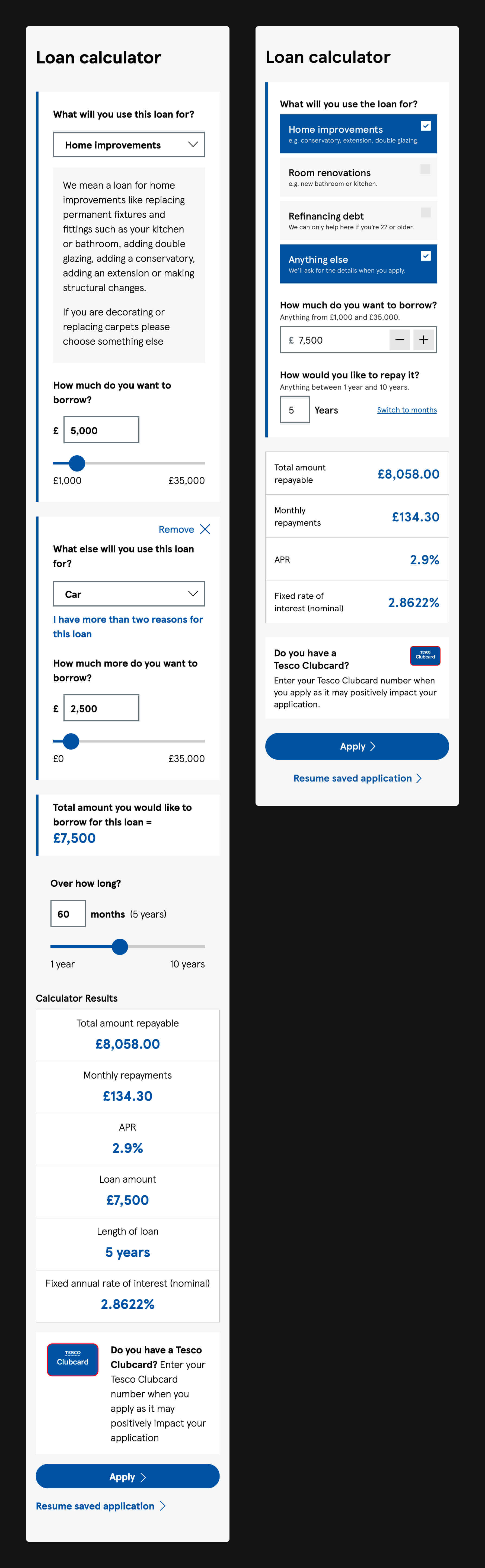
Putting it all togetherPermalink
Loan purpose
The current loan calculator allows you to add up to three different purposes of the loan. For the sake of this review, I've assumed this to be an arbitrary cap that limits an already long form from becoming unusable. If I'm wrong, and there is a legitimate requirement to limit the loan purposes to three, it would be straightforward to communicate and enforce this.
Now, there are eleven different loan purposes the user can choose:
- Home improvements
- Redecorating
- Furniture/carpets
- Setting up home
- Car
- Other vehicle
- Refinancing debt
- Wedding
- Holiday
- Gift
- Other
From trying different loan permutations, it seems that the maximum repayment length is decided by using the shortest allowed period for any of the selections made. For example:
- If I borrowed £7,500 for home improvements, I could repay in seven years.
- If I borrowed £7,500 for a wedding, I could repay over five years.
- If I borrowed £7,500 for home improvements and £7,500 for a wedding (total £15,000 loan), I would have to repay the entire amount over five years.
'Home improvements' is the first in a long list of possible purposes given to the user, but with 'Redecorating' also being its own option (technically a home improvement itself), the definition of what is and isn't acceptable here becomes less clear. In an attempt to solve this, an additional explanation is presented when 'Home improvements' is selected.
Aside from the refinancing of debt, which is only available to customers who are 22 or older, every single other option behaves in exactly the same way: they all have the same limits of how much can be borrowed and the period it can be repaid in.
With all of the above in mind, we're left with the following:
- It should be clear what is and what isn't a home improvement, even before any selection is made.
- It should be clear that debt refinancing is only for people over 22, even before any selection is made.
- The form gets very long when multiple purposes are chosen.
- Aside from 'Home improvements' and 'Refinancing debt', every single other option behaves in the same way.
At some point, Tesco Bank will need to know exactly how much a customer is borrowing for each specific purpose, and that sort of detail is ideally suited to an application process; especially one made by somebody who knows they can borrow what they need to, and for the period they they need it for.
The loan calculator's job is simply to communicate what the bank can offer, eliminating some users from consideration, and providing confidence to everybody else. What's more, it should do it as quickly and as painlessly as possible.
If we acknowledge that 'Home improvements' is too vague without an additional explanation, then one solution is to break the category down into smaller, better defined options. The explanatory text displayed mentions a host of improvements that benefit the house as a whole, as well as a couple that improve specific rooms. As such, we can solidify our description of a home improvement by removing anything that falls outside an improvement to the building itself.
When we present only the options that need to be distinct, we're left with the following four loan purposes:
- Home improvements
- Room renovations
- Refinancing debt
- Anything else
At some point in the loan application, Tesco Bank will need to ask any customers who selected 'Anything else' what their loan is for. But until that point, there's no need to complicate the calculator when the details can wait.
Removing range sliders on small screens
Range sliders can be tricky to use even with a pointer input like a mouse. On a tiny touchscreen, it's an even more arduous task.
Sliders are a good option when a precise value isn't needed. This may be true for users who are simply testing the waters, but most will have a fairly clear idea of what they need to borrow, and for how long.
Instead of relying to range sliders, I would allow users on a mobile device to enter their chosen amounts using a numerical keyboard, with the introduction of a stepper helping them make small changes to the loan value without needing to retype a four or five figure number. For users needing to only borrow a small amount, they will be able to input their chosen value with only a new taps, increasing the default £1,000 value in increments of £500.
Front-loading important details
When you have to stop a user to tell them they can't proceed, you've already let them go too far in the wrong direction.
Loan limits are only presented once the user has exceeded or fallen below what is acceptable. This approach encourages errors, and forces the user to make mistakes before receiving the advice they need. Presenting these instead immediately reduces the risk of error, and informs all users of what they can and cannot do without having to investigate through trial and error.
Simplifying the calculator results
Every extra element on a screen adds additional noise, and the more items you present in a list, the more likely it is that some of the items are going to be missed.
In the live version of the loan calculator, six different results are presented. However, one of these six is a 'Loan amount', which is necessary because loan purposes are captured separately, and another is 'Length of loan', which is a years/months representation of the loan period, needed only because the user can only enter this in months.
By simplifying the form itself to use only a single value input and a flexible repayment input, we're able to also simplify the calculator results, presenting only the four most valuable pieces of information.
The outcome
On larger screens, the improved version of the loan calculator uses as little as half of the vertical height as the current version in certain scenarios. The loan purposes and important details are clearer, the combined loan amount simplified, and the method of entering a loan repayment period more flexible. 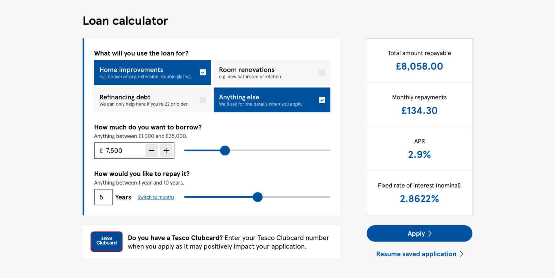
When users hit errors where more than a single loan purpose has been selected, the reduction in vertical space and complexity is even more pronounced. The three error messages needed can now be reduced into a single sentence, which itself is presented immediately besides the one offending input.
With the substantial reduction in space between the form element and the calculator results, users can now see the impact of their actions while making changes to their loan requirements. Minor layout improvements to the calculator results and the Clubcard section further reduce the height of the tool.
Similar to the improvements on larger screens, any errors that happen on a mobile device are dispersed and unnecessarily complicated. The space savings at this size is the most impressive of all the comparisons, and more importantly, the user's focus is directed at a single issue, rather than three.
What nextPermalink
If you've made it this far, thank you for reading! Hopefully you found this post interesting, learnt a little about what it is I do, and how to improve an already well made tool. If it was useful, please consider sharing it, and whatever you thought, let me know on Twitter. I'm especially keen to hear:
- What did you like about the review?
- What else would you have liked to see?
- Would you be interested in seeing more of these reviews?
- Would you have preferred this review as a video, and if so, why?